More photographs than ever before were shared on each of the major social networks last year; and this year they want us to share even more.
Photography: This is where the true competition lies between each of the social networks, and the evidence can be seen in the number of changes each made to their image systems in the last 12 months.
In 2012 Twitter, Google+, and Facebook each made significant changes to how they let us upload and access photographs on their sites. Twitter created a new image gallery, showing each of the photos that you’ve Tweeted – and even rolled out its own Instagram-like image filtering service.
Facebook changed how it displays images, which are now larger than they were a year ago. They even changed how you can upload your photos, using a drag and drop feature (not to mention that they spent one billion dollars buying Instagram). In 2012 Google shut down its online image editing site, Picnik and move its services over to Google+, allowing users to directly alter and enhance images through the site.
After all this it has to be asked, which social network treats our photographs the best? If you’re going for quality which site should you use the most?
To find out we uploaded one image to Twitter, Facebook, and Google+. We then downloaded the images from each of the sites to see how each of them altered the photograph. For this test we avoided sites like Instagram, which are designed to alter our images. We just wanted to see which of the big three social sites reproduces our photographs with the highest fidelity.
In each case we uploaded the same image to each of the sites using their default image upload systems (no third party apps were used). While this was fine for Facebook and Google+, for Twitter we had to first resize the image to 2.957MB (Twitter will only upload images that are less than 3MB in size) – we did this by taking a raw copy of the image (which weighs in at 20MB) and resizing it’s dimensions by 60%, so while the width and height of the image was smaller the photograph itself was of the highest JPEG quality possible.
Here are the results
The most obvious and significant change in the uploaded images was their size. The original images was 4.57MB (4570KB). None of the social networks can be said to reproduce our test image anything near its original quality.
Google+ was the best, although that’s still not saying much. It compressed our image to 8.7% of its original size (399KB) and even though this compressions ratio is massive it is still nearly twice the size of Facebook, which compressed our image down to 4.6% of its original size.
However, Twitter was by far the worse for reproducing the original image quality. At just 71.3KB, Twitter compressed the image down to just 1.5% of the original’s size (including the changes we had to make in order to upload the image).
| Original | Google+ | ||
| 4.57MB | 71.3KB | 211KB | 399KB |
Next we looked at the dimensions of the uploaded images. The original JPEG was a healthy 5184 x 3456 (18 Megapixel) photograph. But after uploading to the three social networks the image was drastically resized.
Twitter was by far the worst creating a version of the photograph that was 1024 pixels wide and 683 pixels in height (19.75% of the original’s dimensions) – this is half the size that Facebook and Google+ resized the image to.
Both Facebook and Google+ resized the image to 2048 pixels wide but only Google+ kept the original dimensions, creating an image that was 2048 by 1365 (39.51% of the original photograph). Facebook added an extra line of pixels at the bottom of the image creating on that was 2048 by 1366 (which isn’t a major sin).
| Original | Google+ | ||
| 5184 x 3456 | 1024 x 683 | 2048 x 1366 | 2048 x 1365 |
Finally, and most importantly, we wanted to see how crisp the photographs were after being uploaded to the sites.
Rather than just showing a pristine copy of the photographs that we upload, each of the sites (as we’ve seen) makes a number of alterations to them.
This process leads to more noise being added to the photographs and results in a lower quality image. While this isn’t immediately obvious when you’re viewing the images individually, when you look at them all together you can see a significant difference in how good your photographs look.
Says a thousand words
So, what does all this mean for images we upload to these sites?
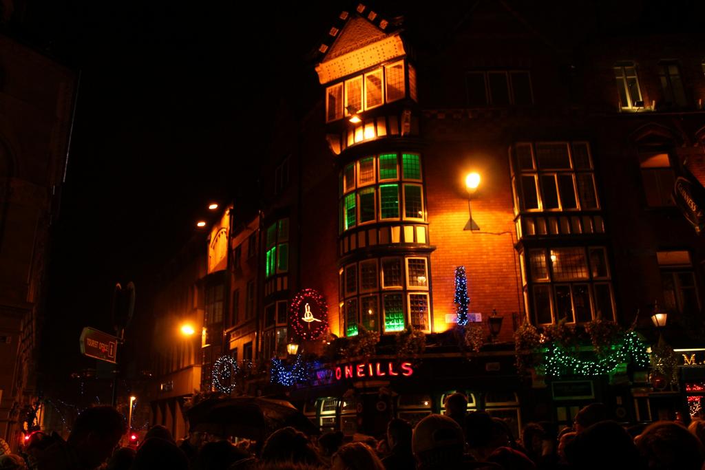
This is the original image (click to enlarge), which shows Dublin City at night on New Year’s Eve 2012 – it’s nothing special as a photograph, but typical of something that might be uploaded to various social networks.
This is Twitter’s version of the image, after being uploaded to the site. At first glance it looks pretty much the same, but take a closer look at the brick work and the Christmas lights and you can see some loss of detail.
Facebook’s version of the image is a little clearer than Twitter’s but there is still some obvious signs that it’s been altered. Have a look at the windows on the top right hand side of the photograph, you’ll see they appear darker and less defined.
- Google+ image quality
Google’s image quality is much better- compare the windows on the right of the image to the same ones on Facebook’s copy of the photograph. You can see more of them and they are clearer.
Detailed look
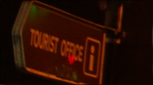
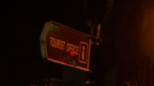
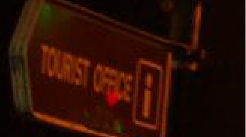
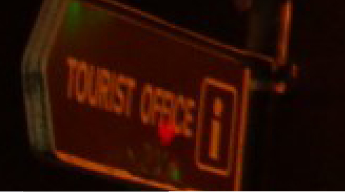
To show this deterioration more clearly we took each image and zoomed in to 300% their original size. To make the JPEG artifacting obvious we focused on an area of the image containing text (the road sign for the tourist information office).
On the original image, at 300%, some small JPEG degradation is visible but each of the letters can be clearly read.
Twitter’s compression of the image is probably the worst, it’s difficult to make out individual letters on the sign and the red mark under the word “office” seems to be enlarged.
Facebook’s image compression is not as bad as Twitter’s but it still mangles the image so much that some letters, including both the i letters in Tourist and Office are blurred beyond recognition.
Google+ is the most sympathetic to the original image; there’s certainly some degradation on the photograph but most letters are visible.
Accessibility over quality
So, why the huge discrepancy in image quality between the sites? The logic for Twitter’s poor showing is probably down to its emphasis on mobile users. Since more users will come to the site on mobile devices, which have less processing power and slower net connections than desktop devices, a lower quality image will load faster.
As for Facebook and Google+ both sites want users to upload as many images as possible, since users engage more with image content than text content, so the lower quality of Facebook’s images is harder to understand. But it is clear that photographs uploaded on Google+ are clearer than those uploaded to Facebook.
So does this mean that you should not upload your images to Facebook? No, it mean that you should be careful not to delete images after uploading them to any social network – always keep the originals and use these to make copies or prints.
The point of uploading images to any social network is to share them, rather than archive them. And the price for this ability to instantly share your photos is a loss of quality.


