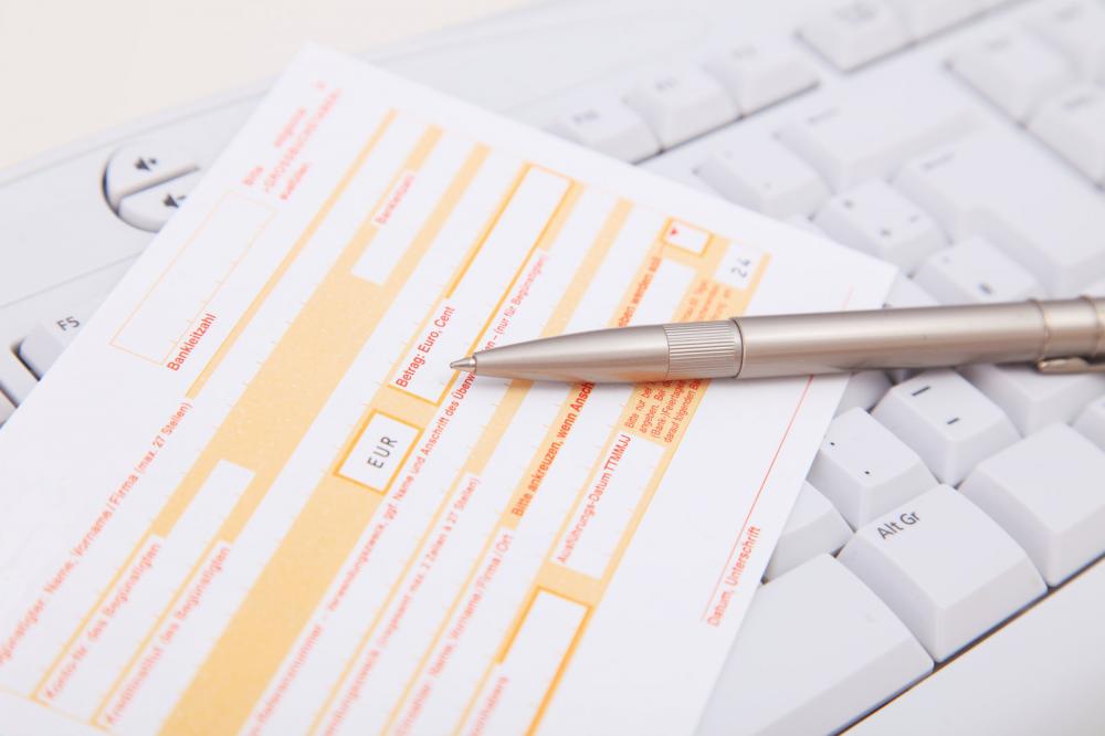
Online forms have had a great amount of importance ever since the trend of buying, selling and interacting online became the so widespread. By simply filling in the relevant information people could have access to unlimited amounts of knowledge, data and information.
However, for the people who design these forms, it is always a challenge to create online forms that are as user-friendly as possible. That task is a lot easier said than done because of how each person’s aptitude and the ability to understand the information required in the forms. While there are a lot of creating options with free forms that these developers can choose from, it’s ultimately up to them to design a form that the customer will find easy to fill.
There are certain tips that can help them design a thoroughly user-friendly and well-rounded online form.
Some of these tips are:
The labels:
One of the most common issues and complaints that people have regarding a lot of online forms is the fact that there are multiple labels that are not properly and clearly visible until they are focused on. This might work for some forms but as a general rule it can only serve to confuse the person filling the form.
On forms that are meant to offer services, these labels should be permanent so that a person can properly review what they have entered after filling in their information.
The font:
Another problem that a lot of customers face is the font size. It becomes even more irritating when even increasing the font size through the browser doesn’t work due to the form’s in-built mechanism. This can serve to irritate the form filler and make it incredibly complicated for people who have some form of visual impairment or eyesight problem.
Have a visible enough font size that can be easily comprehensible.
The Input fields:
What’s the point of having similar input fields when asking a person for their preferred prefix and their name? It causes needless confusion and can lead to the form filler filling in wrong or incorrect information.
The checkboxes:
Traditionally, checkboxes should be designed in such a way that they should properly denote whether they’ve been selected or not. There are some forms where no matter which option you choose, there won’t be any distinction. This can lead to the form filler having some confusion about which box has been filled.
The error:
While it’s logical that there will be an error if there’s lack of proper information filled on the form, what makes it irritating is when the error is too general. The best way is to have a specific error message pointing out the exact error that has been committed while filling the form so that the filler doesn’t have to scan the entire form again to look for the error.
If you’d like to create a form for any purpose online then 123FormBuilder offers you the best templates as well as customizable options to create a form according to your needs here.


